PT/EN
Il Cannolo
Visual Identity

Il Cannolo

From Sicilian tradition to business growth, an identity that values origin, product and every stage of growth.

Introduction

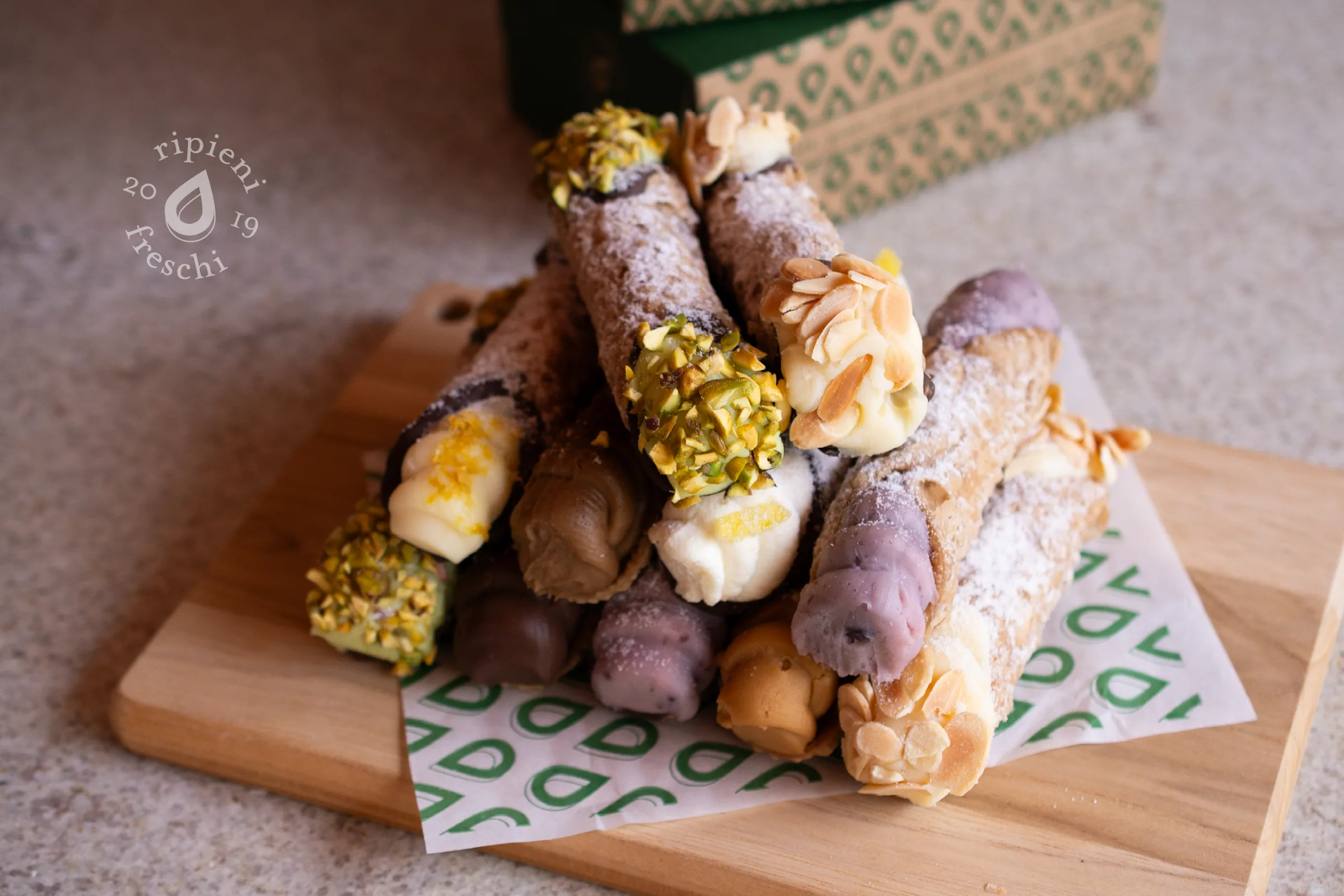
Inspired by the traditional Sicilian cannoli, Il Cannolo is a family brand whose product quality was not yet reflected in its presentation. The project was born from our perspective as consumers, as we identified the opportunity to bring the experience offered closer to the perception conveyed by the brand.
Introduction

Goal

Visually reposition Il Cannolo through an identity and packaging that would highlight its Italian origin, authenticity and artisanal quality. The proposal also needed to keep pace with the evolution of the business, balancing brand expression, functionality and production feasibility.

Goal

Challenge

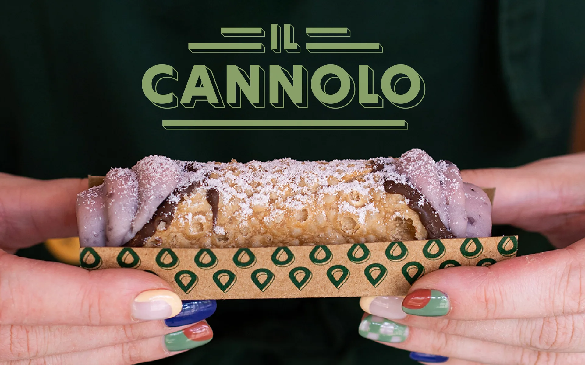
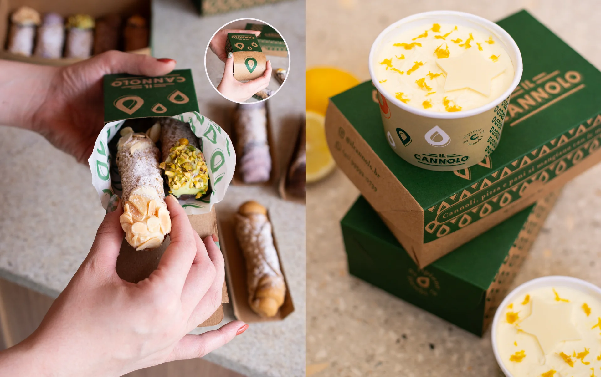
The challenge was translating Sicilian tradition into a contemporary language, respecting the resources and needs of each phase. From the first stamped applications to kraft packaging with single-color printing, every solution required creativity to balance visual impact, costs and consistency.

Challenge

Result

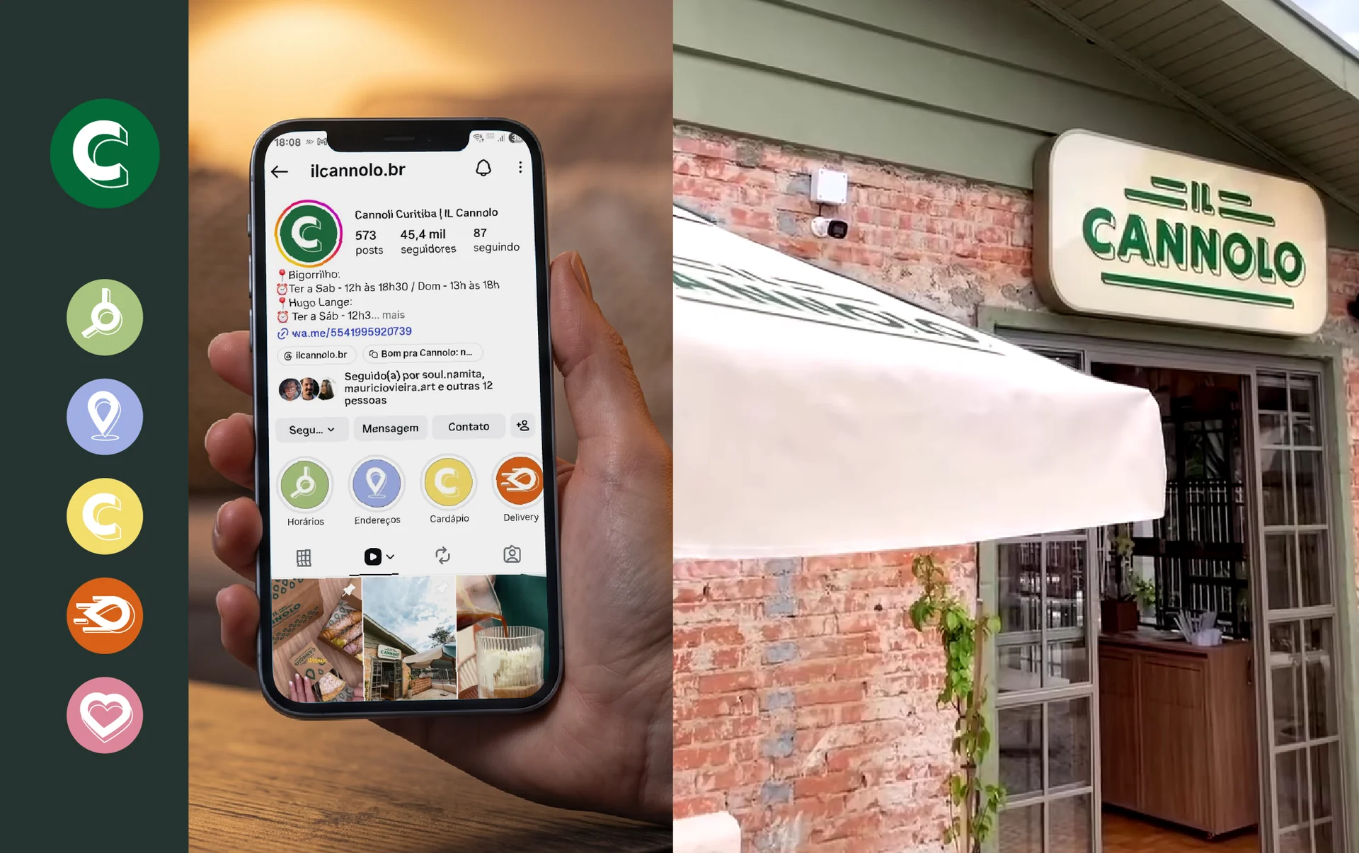
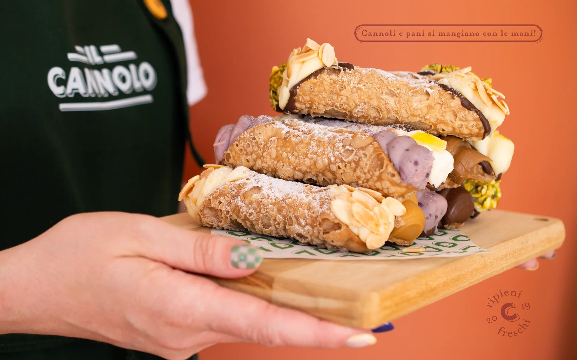
We developed a visual identity with references to Italian culture, unfolded into patterns and packaging that accompanied three phases of the business. From the initial redesign to the opening of two locations, the brand gained a consistent, flexible language, incorporating new applications for a growing product portfolio.

Result